Related Books:


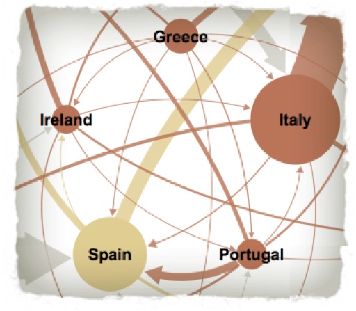
Bill Marsh. “It’s All Connected: An Overview of the Euro Crisis.”
Perhaps you, like me, came across a delightfully elegant, delightfully lucid interactive chart of the European financial crisis in the online edition of The New York Times last fall. Clicking through its various cataclysmic scenarios, watching the arrows shift and the pastel circles grow pregnant with debt, I was able to comprehend, for the first time, the convoluted and potentially toxic lending relationships between Greece, Italy, and the rest of Schengen Europe as well as the implications of this toxicity for the wider world. The reduction of such messiness into such neatness filled me with a familiar, slightly nauseating feeling of delight, a feeling I have since dubbed the infogasm. This fleeting sense of the erotic occurs only when a graphic perfectly clarifies complex phenomena through the careful arrangement of its visual data sets. The infogasm is instantaneous, overwhelming, and usually transitory in nature, leaving you oddly exhausted. Plain old text does not function with quite the the same epiphanic climax; by comparison, the written word’s magic is elusive and lingering, often revealing its fruits much later, after the article has been finished and put away.
In 1976, neuroscientist Douglas Nelson definitively described the cognitive potency of the image as the pictorial superiority effect. He and others have shown that our brains are essentially hard-wired for visuals—the very architecture of our visual cortex allows graphics a unique mainline into our consciousness. According to Allan Pavio’s somewhat controversial dual-coding theory, imagery stimulates both verbal and visual representations, whereas language is primarily processed through only the verbal channel. While there has been considerable pushback to Pavio’s theory since its introduction in the 1970s, numerous experiments have shown that imagery activates multiple, powerful neural pathways of memory recall.
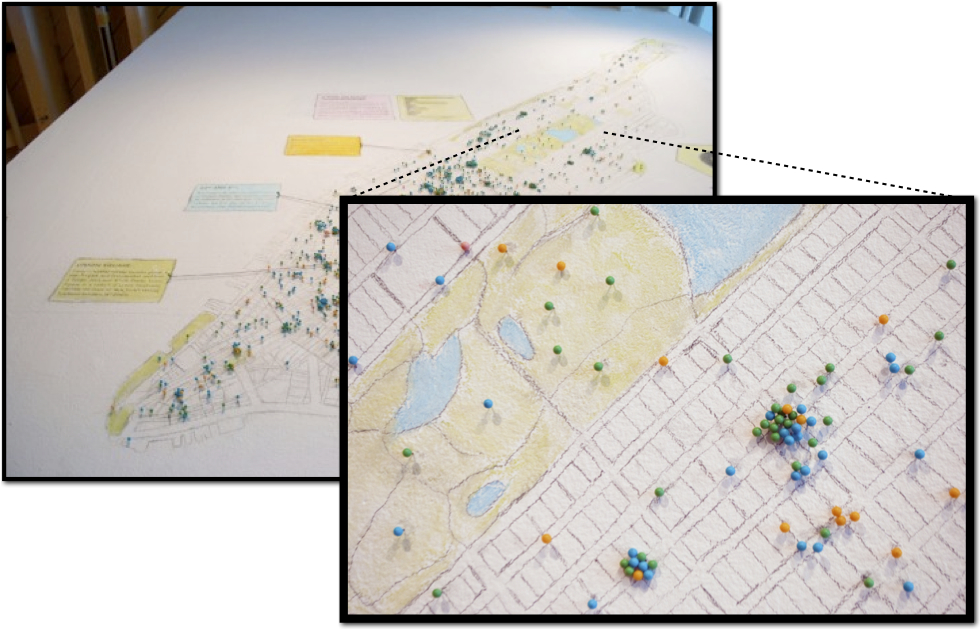 Detail from Ingrid Burrington, “The Center for Missed Connections.”
For instance, when we look at Ingrid Burrington’s hand drawn map of all the missed connections posted onto NYC’s Craigslist in May 2010, we react instantly to the familiar visual representation of Manhattan and Central Park, but we also extend our own mnemonic narratives around the graphic. We replay our own experiences of the cityspace, our own missed connections at these “hot spots” of loneliness. We remember the girl with red geek-glasses who stooped down to give us back our pen outside of the LensCrafters on 81st St. We place our own mental pin on the map alongside the others. But what color do we choose? Are there different categories of missed connections?
We turn to the key for answers. Of course:

We turn back to the map, reexamining the city with a new filter. What’s with the trio of W4Ms at 85th and 2nd? Were these all the same person, a missed encounter on repeat? And why so few W4Ws? Who was that W4W in front of the Museum of Natural History? Was she about to enter the museum, or was she already emerging—basking in the wondrous glow of science—when she spotted the other woman? (Maybe the museum never entered into it.) Hundreds of possible stories like these spin forth from Burrington’s map, and from the visible sum of these individual happenings a larger narrative of urban voyeurism emerges. In straddling the visual/verbal divide, infographics like this map first gain entrance by using the succinct allure of imagery, but then linger in our imagination by nurturing our hunger for cultural narration.
It is no surprise, then, that our media are now saturated with such infographics, both on-and off-line, as a host of publications such as The New York Times, Good, The Guardian, Wired, Time, The Economist, The Believer, and The Wall Street Journal all regularly depend on data visualizations to provide their readers with that on-the-spot, quasi-highbrow sociological analysis. As one might expect, the output is decidedly mixed. Faced with a glut of mediocre charts and diagrams, there is now a backlash among designers and journalists against the overuse of meaningless infographics.
Here, graphic designer Alberto Antoniazzi pokes fun at the media’s ongoing love affair with the snappy graph:

Alberto Antoniazzi’s “Most Popular Infographics You Can Find on The Web”
His point is certainly taken: just because something looks good, doesn’t mean it says anything of value. And yet, as someone obsessed with the methodologies of storytelling, I cannot help but wonder about the hidden narrative mechanics behind the infographic. Perhaps my infogasm is not as superficial or ephemeral as it might first appear.
A large part of the infographic’s intrinsic appeal seems to lie in its visual reductionism of complex information. Reductionism itself is not inherently bad—in fact, it’s an essential part of any kind of synthesis, be it mapmaking, journalism, particle physics, or statistical analysis. The problem arises when the act of reduction—in this case rendering data into an aesthetically elegant graphic—actually begins to unintentionally oversimplify, obscure, or warp the author’s intended narrative, instead of bringing it into focus.
 Effectively pairing depth with breadth is not a new problem. In his sprawling history of information, James Gleick describes how the invention of the semaphore, telegraph, telephone, and the first digital computer all posed significant discursive dilemmas by offering a simultaneous increase in the ease of data delivery alongside a necessary contraction of the language around this data. “The bit” was invented in the 1950s by Claude Shannon to describe the most basic unit of information, essentially an on-off binary—the amount of information required to decide a coin flip. The more possibilities, the more uncertain the eventual outcome, the more bits are needed. As Gleick writes, “Information is uncertainty.” In this context, the last thirty years have been particularly revolutionary because of uncertainty’s unprecedented growth—we’ve been forced to radically adapt the ways we interact, exchange, and conceptualize our society’s information currency. The gigabyte—one trillion bytes of digital information—has now entered our everyday lexicon not just in reference to a computer’s storage capacity but as a metaphor (however inaccurate) for the memory in our own brains. Surrounded by a rising sea of uncertain bytes, our culture has become desperate for effective ways to visualize and synthesize all of this data, lest we become completely overwhelmed, brought to our knees by a state of total noise (to borrow David Foster Wallace’s term).
 In 1983, Edward Tufte—considered by many to be the Godfather of information design—published his now-seminal The Visual Display of Quantitative Information, which began to articulate an ethos for what was then still a relatively nascent discipline. Since then, much has changed in the field of data visualization, especially once the graphically flexible web page became the standard information carrier and the rise of Web 2.0 essentially allowed anyone—whether they were a professional or an amateur—to effectively present vast datasets. But as futurist George Dyson points out, while our access to raw information has grown exponentially, our time to process this information has declined rapidly, which has placed an unprecedented premium on the act of meaning-making. Since we no longer have the time (or at least we don’t grant ourselves the time) to generate our own analysis, sift through the evidence, or weigh competing narratives, we find ourselves inevitably looking for shortcuts. And given a) our brain’s preference for the visual and b) the current complexity of our world, we’ve learned that the very best shortcuts usually come in graphical form, preferably with lots of arrows, preferably with some kind of interactive element that makes us feel like we too are actively crunching the data. Consequently, we’ve given today’s visual storytellers considerable power: for better or worse, they are the new meaning-makers, the priests of shorthand synthesis. We’re dependent on these priests to scrutinize, bundle, and produce beautiful information for us so that we can have our little infogasm and then retweet the information to our friends.
 Ever-present but often unexamined, the expanding discipline of information graphics has been in desperate need of a comprehensive survey, a checkpoint to measure the field’s varied progress. Luckily, Berlin-based Gestalten Books has provided us one in the brilliant Visual Storytelling: Inspiring a New Visual Language. Like most cool things in my life, I first heard about Visual Storytelling from Maria Popova’s masterfully curated Brain Pickings. Sometimes design compendiums can come off as uneven affairs, but Visual Storytelling is a thoughtful, curated tour de force—it effectively encapsulates a watershed moment in information design while still managing to hold up as a standalone volume.
The book presents over 100 designers from around the world (not surprisingly, much of the best design work comes for Europe), gracefully organized across five chapters: Seeing the News, Viewing Science and Technology, Looking at Travel and Geography, The Modern World, and Observing Sports (the active verbs are telling). Perhaps my favorite part of the book is a section entitled “The Visual Storyteller,” which features a series of interviews with leading designers (including Steve Duenes, head of the visual journalism section at The New York Times) about their techniques, influences, and concerns for the future of the discipline. Several of their sketches and drafts are also presented alongside their finished work and it was helpful for me to see their work in this kind of context. Pulling back the curtain on their process made the sometimes overly slick infographic feel like a very human creation. These practitioners, like us, are constantly struggling with how to represent the world around us. Such an ambitious pursuit will always remain a work-in-progress.
 Densitydesign. Draft for How’s My Fishing? Greenpeace “Oceans” Campaign
Most of the graphics in Visual Storytelling are terrific. Some of them are beautiful. Some of them are completely confusing. Taken in its entirety, the book feels like an honest, wide-reaching portrait of the field. But be warned: this book is strong medicine. When faced with a cornucopia of such infographic pornography, the brain begins to shut down, so in order to avoid infogasm overload, I recommend getting your dual-coding fix in small, measured doses, and then putting the book down and slowly moving away from it.
Several of the more successful examples in Visual Storytelling showed me just how nuanced the infographic’s narrative alchemy can actually be. Indeed, looking through this volume, I came to realize that skillfully rendered visuals, like any effective medium, present the reader with a layered release of storylines. An initial narrative will shift and deepen under sustained scrutiny, raising a series of questions that build off one another.
A terrific example of this is the illustration of the country’s overall democratic shift in between the 2004 and 2008 elections (also from Steve Duenes’s team at the Times):
 “For Much of the Country, a Sizable Shift.” The New York Times. (11/6/08)
More effective than any text-based narrative, this graphic quickly illuminates how and why Obama got elected. Here we can easily see how almost all of the West (save McCain’s Arizona) shifted considerably to the left. This does not mean all these states went Democrat—of the Mountain states only New Mexico and Colorado voted for Obama—but rather that the barometer of the average American voter changed significantly. The only regions that went remarkably right of 2004 were Appalachia and the so-called Bible Belt, both places which would later become fertile grounds for the Tea Party.
There are also many questions here: What happened along the Texas/Mexico border? What about eastern North Dakota? Did Massachusetts vote more conservative simply because John Kerry was not running? Or was there another factor at play? The whole narrative of the election is not encapsulated in this graphic, nor should it be—infographics are at their best when they help you visualize one particularly illuminating trend that could not be told in any other way. The most successful infographics operate with elegance and restraint, and it is this restraint—this withholding of other information so that you can see a point clearly—that forces you to ask the big questions. When firing on all cylinders, infographics are almost always the beginning of a conversation, not the end of it.
Other graphics in Visual Storytelling demonstrate the fraught collision point of art and data, a grey area that has caused a lot of tension among designers and statisticians alike. There is the startling 100 Years of World Cuisine, a powerful composition that uses various containers of blood arranged across a kitchen table to tell the history of bloodshed in the 20th century.
 Clara Kayser-Bril, Nicolas Kayser-Bril, Marion Kotlarski. 100 Years of World Cuisine.
By tackling such a complex subject as human bloodshed with the metaphor of food preparation, the graphic risks oversimplifying the historical and cultural forces at work in all of these conflicts. Indeed, when pressed, the metaphor begins to unravel, or at least raise unintended questions: who’s preparing this food? Why the creepy suspended ladles? Why are the Congo Wars about to get the KitchenAid mixer? Such quandaries highlight the sometimes thin veneer that can lie beneath a visual’s initial sensational impact. Then again, maybe this graphic is not asking for such close reading, nor does it claim to explain every piece of historical nuance. Its purpose is to be sensational and help you visualize what were previously murky statistics. What it does do well: show how relatively few people were killed in the Yugoslavian conflict (130,000) compared to the wars in Congo (3.9 million) or even the 1941 partition of India (500,000). Is this purpose enough to forgive the exploitative overtones of the piece? I’m not sure, but it certainly got me thinking about what infographics should and shouldn’t do.
Visual Storytelling also features a fine selection of work from Nicholas Felton, one of our more gifted manipulators of visual information. Feltron, as he is know professionally, is particularly adept at allowing an emotional resonance to rise from the coalition of what would otherwise be fairly stark data. His graphics and typography are pristinely rendered, with ample whitespace, but like all great storytellers, he knows that cultural (and personal) pathos arises from what data you leave off the page.
 Nicholas Felton. “Rising and Receding.” McSweeney’s.
In “Rising and Receding,” Felton collects a surprising range of social indicators and measures their shift since the economic downturn. Aside from the 300% upturn in familicide, none of these markers are all that extraordinary on their own—people are buying more Kellogg cereals, donating more sperm, having safer sex. Pollution is down, sleep issues up. Yet this infographic succeeds because the collective collation and bare presentation of this data against the backdrop of a recession offers us a fleeting peek into intimate moments during hard times, albeit intimacy that is repeated across millions of households. Felton knows that to convey a trend most effectively, you must leave room for a dual narrative—the reader needs to process the information on both a public level (“Births are down?”) and private level (“Could we afford a child right now?”).
Felton has become well known in design circles for publishing his own annual report, in which he collects, graphs, and maps his personal life in numbers: miles walked, number of music tracks played, pages read, shoes purchased. He undermines our expectations of how a corporate annual report should function by co-opting the form to examine the banalities of the everyday: Social Stella consumption: 157, down 46% from last year. Occasionally he will throw in a category that is not so much a category but rather a story left untold: Burglars confronted: 1, at apartment window. These reports are so seductive because of their clinical composition and yet from this austerity, a kind of universal vulnerability emerges. We know it is much messier than these clean lines of data suggest. In his attempt to summarize a year of his existence entirely through statistics, Felton essentially points to the beautiful impossibility of this task.
 Nicholas Felton, “2010 Annual Report.”
Visual Storytelling includes an excerpt of his 2010 annual report, in which he turns the lens of examination onto his recently deceased father. Many who have lost a parent are familiar with the task of sifting though a lifetime of mementos, receipts, and photographs, but Felton takes this process a step further by using all of his father’s detritus to fashion a comprehensive notitia memoriae—charting the life of a man who was born, who lived, who worked, who bore children, who loved, who died. We are more than sum of such evidence, but the evidence itself is at once heartbreaking and triumphant.
Beyond these data-driven graphics, Visual Storytelling contains an array of more abstract, artistic pieces that provide a nice counterpoint to all of the nerdy number-crunching that often dominates the field. These are not infographics per se, but they ask questions of our intense relationship to images by playing with familiar visual tropes. We have grown so comfortable with graphics in our lives that we often forget to maintain any kind of critical awareness about how infographics function, how they lure us in, how they tell their stories, how they can lie to us.
Toilet Paper magazine’s segmented fingernail feels sensual and subversive, yet utilizes a visual language of declension that we immediately recognize from our chart-heavy lives:
 Maurizio Cattelan, Pierpaolo Ferrari, and Micol Talso. “Untitled.” Toilet Paper, Vol. 2
Yet there are no scales, no reference points, no key: what is growing smaller here? Is it us? Or are we the culmination of the graph? By leaving so much unspoken, the image implicitly asks us what happens when our bodies become the new pallets for information design. How will we mark out units? And what will the units be? Perhaps this process has already begun.
Maria Fischer’s Traumgedanken is a book on dreams that employs colored threads to connect and cross-reference ideas, calling into question the physical manifestation of the hyperlink:
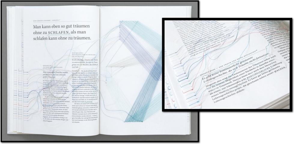 Maria Fischer. Traumgedanken.
HTML linking is so familiar to us now that it has essentially become invisible: we rarely stop to think about the implications of these virtual threads on sourcing, intellectual property, clarity of thought. We think: there is a link, so it must be connected. But is this bit of code enough? Will association eventually replace all exposition?
This is not to say that everything contained in Visual Storytelling is a perfect culmination of the genre. Whether wittingly or unwittingly, the volume also contains several overburdened examples of information design, where the visual language of the graphic has completely obscured the meaning. Yet these failures were some of the most interesting images for me. We can learn a lot when the designer has lost the forest for the trees:
 Francesco Muzzi. “La Fabbrica del Sapere.” Wired Italia.
Francesco Muzzi’s illustration of the Italian education system is graphically busy, like a Terry Gilliam movie gone wrong, but it’s also trying to do way too many things: to cover daycare through graduate school, to chart dropout rates, hours at school, and numbers of teachers, to list teacher salary, student debt, and graduates searching for work abroad. The designer makes the mistake of thinking complex data needs complex presentation, when in fact the opposite is true. One sees this same kind of visual cacophony all over the media. Readers (myself included) are guilty of succumbing to such colorful temptations: we see lots of bells and whistles, and even if we don’t really understand what’s going on, we feel as if we are absorbing (via osmosis?) something potentially deep and prescient from all that data.
Ironically, Andrew Losowsky’s introduction to Visual Storytelling, the most text-heavy section of the book, is one of the few sections that is poorly executed, suffering from some of these same symptoms of over-design:
 The introduction to Visual Storytelling: So much text, so little time.
Heavy quotations, unresolved and unexamined, slap you in the face as you try to follow the meandering text columns. The physical congestion of words on the page quickly overwhelms the actual content of the words themselves, as if the act of reading was a mere afterthought. It’s comforting to know that text still needs quiet order to function well, and particularly in this age of hyper-stylized form, there’s the constant risk of gilding the lily. I often feel this kind of pummeling when I’m trying to work my way through certain webpages with multiple, unrelated threads all vying for my attention.
Fittingly, in this same spatially fraught introduction, Losowsky touches upon the dangers of graphic imprecision when he points to the epidemic of errors in infographics that depicted Osama Bin Laden’s death. These widespread mistakes, picked up and repeated across a wide swath of publications, prompted graphic designer Antonio Giner to pen the Statement Against Fictional Infographics, subsequently signed by 107 designers from 27 countries. The six-point manifesto culminates in this demand:
6. Infographics are neither illustrations nor “art”. Infographics are visual journalism and must be governed by the same ethical standards that apply to other areas of the profession.
Whether this distinction can be made in practice remains to be seen. Visuals are a notoriously slippery medium. Thousands of minute decisions (or non-decisions) go into a graphic’s formulation—everything from color to scale to line thickness to use of symbols. Seemingly simple questions of graphical form can have powerful implications.
This was never more evident than during the health care debates in 2009, when Rep. John Boehner produced a maddening flow chart of the Democrats’s health care proposal at one of his press conferences, presumably in an attempt to underscore the plan’s inefficient bureaucracy:
 Boehner’s mindfuck of a flow chart.
This deliberate obscuration of the issue by way of poorly assembled visuals rubbed many designers the wrong way. Boehner’s flow chart set off what data visualizer Alex Lundry called “Chart Wars,” in which tasteful redesigns of the same graphic demonstrated just how subjective and influential the visual presentation can be. This is always true, but with data visualization, the old adage is essential: the form is the content.
Beyond political fisticuffs, poor design decisions can have serious, even deadly, consequences. During the critical days prior to the Columbia shuttle disaster in 2003, while the damaged shuttle was still in orbit, a team from Boeing was asked to make a diagnostic Powerpoint presentation to senior NASA officials predicting the extent of damage to the wing and the risks of the shuttle reentering the earth’s atmosphere. Boeing’s presentation was incredibly convoluted, hampered in large part because of the inept visual delivery of its information. Edward Tufte, a longtime critic of Powerpoint’s bureaucratic clumsiness, painstakingly analyzes one of the Boeing slides:

From Edward Tufte’s “Powerpoint Does Rocket Science: Assessing the Quality and Credibility of Technical Reports.”
Tufte points to the elaborate, meaningless hierarchy built into the Powerpoint program that here manifests in six levels of information, denoted by a range of dashes, shrinking bullet points, and throwaway parentheticals. In fact, the executive summary at the top of the slide is slowly undermined by each successive point, though this is lost in the slide’s garbled techno-speak. “Significant” or “significantly”—a vague but promising word—is used five times, each time with slightly different meanings, none of them referring to “statistical significance.” The lack of clarity in this presentation eventually contributed to NASA’s conclusion that it was safe for the shuttle to return to earth, a decision that would end up proving fatal.
Despite the great pleasures of the infogasm, it is evident that now, more than ever, we must be cautious with our information design. Visuals are easy to make, but they are also easy to fake, and their allure can turn them into potentially dangerous pieces of evidence. Despite Giner’s manifesto for clear standards in visual journalism, infographics—guided by designer, journalist, statistician, and artist alike—will probably continue to operate in that grey area between fact and fiction, egged on by our insatiable hunger for their graphical eros. I don’t think such fuzziness is all bad—most new fields, particularly those with wide-ranging sociopolitical implications, need time to find their footing and carve out a particular disciplinal language. This does not mean such negotiation should be a passive process. We need more excellent surveys like Visual Storytelling: Inspiring a New Visual Language to help us celebrate quality, shun mediocrity, and articulate the criteria for how infographics can remain luminous and profound. Beyond just disposable feel-good fodder for the Twittersphere, data visualization is the emblematic medium of our times, and the natural evolution of its form might be the greatest predictor of what is to come.