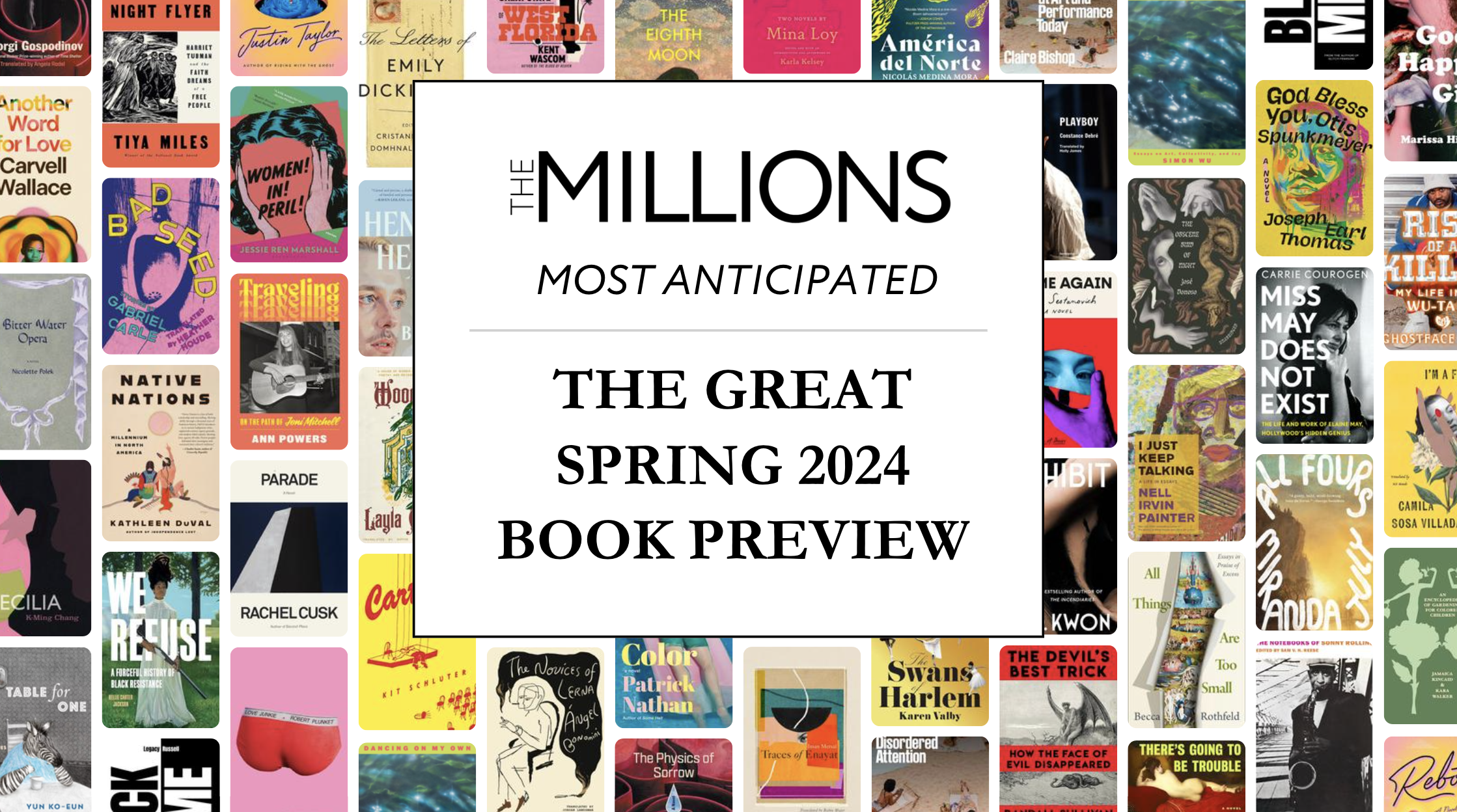
Related Books:


The year is 1962, and ad exec Martin K. Speckter has a punctuation problem.
Madison Avenue is debating the merits of a streamlined new European import called Helvetica. Roy Lichtenstein’s filling canvases with comic book characters and hand-painted typefaces. Andy Warhol’s cranking out Campbell’s soup cans in The Factory. Art is becoming commerce and commerce, art.
Meanwhile, JFK’s in office, the Vietnam War’s escalating, and The Pill’s finally received FDA approval. What’s needed is a typographically elegant way to notate surprise, disbelief, and incredulous excitement. For a single symbol to punctuate sentences like “Who’s that?!” and “What the hell?!”
Speckter’s solution? The interrobang. A stylish fusion of the question mark (that’s the “interro” part) and the exclamation point (known in old-timey typesetter’s slang as the “bang”), his unusual new creation looked like this:
The sassy typographical newcomer was to become something of a pop culture phenomenon during the 1960s, and today often draws comparisons to the bygone craze for Esperanto. It received write-ups in the Wall Street Journal, the New York Herald Tribune, and Time magazine. It found lasting validation in the crisp new pages of American dictionaries, and a more fleeting embodiment in the hard steel keys of a few Remington Rand typewriters and some Smith-Corona accessories manufactured in the day. The interrobang’s creator gave interviews with Dick Cavett and Barbara Walters. Marshall McLuhan wrote about it. Interrabang?! even became the title of a racy Italian movie in 1969. Man and punctuation mark were the talk of the town. And then?
Readers, have you seen any good interrobangs lately? Somewhere along the way, this double-barreled typographical starlet lost its momentum and found its way into the “Where Are They Now?” file.
To remedy this, I sat down with Penny Speckter, the 92-year-old widow of the mark’s creator, to talk about her memories of her husband, his passion for typography, and about her own experiences as a woman working in the heady world of advertising during the Mad Men era.
We met in an East Village Italian restaurant close to her apartment. It was a rainy day and she carried a clear plastic umbrella with a deep dome. She remarked wryly that she needed it “to protect the superstructure,” meaning her carefully styled strawberry blonde hair shaped into a gravity-defying Ann Landers flip. Her voice is rich and resonant. Radio-ready. Full of authority and purpose tempered with mischief and warmth.
Before we began talking, she wanted to show me a few items she thought I “might get a buzz from”: an interrobang key from a Remington Rand typewriter mounted on a clear plexiglass stand, a copy of her husband’s 1971 typographical treatise Disquistion on the Composing Stick, a gold interrobang pin she’s clipped to the cuff of her blazer, as well as an issue of the newsletter she currently writes and edits for The General Society of Mechanics & Tradesmen.
The Millions: The interrobang turns 50 this year. But its popularity has dropped off considerably since the 1960s. Why should we care about it in 2012?
Penny Speckter: This is an election year. I can’t tell you how many times while watching the Republican debates on television that I thought to myself, “What did he just say?!”
TM: What’s your favorite sentence using an interrobang?
PS: “Who forgot to put gas in the car?!” which is not a question.
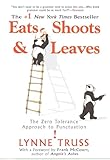 TM: Major publications like the Wall Street Journal gave the interrobang positive press. And it’s been recognized by American dictionaries such Webster’s. But it seems like your husband’s creation has had its share of detractors too. In her bestselling book on punctuation, Eats, Shoots & Leaves, Lynne Truss calls the interrobang “a newfangled and rather daft symbol” and says the name “has the overtones of a police interview terminating in an explosion.” Do you have any comment on this?
PS: Well, that same gal gave a radio interview once where she said the reason the interrobang never caught on was because Martin wanted a royalty. That’s absolutely untrue. The whole idea was to make it ubiquitous. I think she just said what she thought would be fun and expedient.
TM: Okay, so that was one woman’s opinion in 2003. Were there many critics of the interrobang in, say, 1963?
PS: The objection in the beginning was there was no place in the type case for it. And then other people said, well, if you produced it in lead type, it would be useful for a few jobs, but then what do you do with it? The character would always have to be hand-drawn.
TM: This was long before word-processors.
PS: Yes. Everything’s different now with computers. Writing, editing, printing. We don’t know how lucky we are.
TM: So people loved the idea in 1962, but just weren’t sure how to handle the execution. When did that change?
PS: In 1966, American Type Founders (ATF) cast a new typeface called Americana. And a big selling point was it had this interrobang. It was a modern punctuation mark.
TM: And there were typewriters featuring it too?
PS: Yes. Remington Rand made some.
TM: You and your husband both worked in advertising in NYC during the time the television series Mad Men is set. Does the show’s depiction of that world ring true for you?
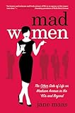 PS: I read an article recently by a woman [Jane Maas, author of Mad Women: The Other Side of Life on Madison Avenue in the ’60s and Beyond] who said she lived it. Well, I lived it too. Not in our agency. Things were pretty tame and there was no hanky panky. We were a small firm and I guess Martin and I set the tone for the people there.
But for strategic reasons we folded Speckter Associates into another big agency in 1969. Then, Martin had a rough heart attack and a later incident which caused me to really push him into retirement. I moved a few of our accounts to another large agency that I’m not going to name, and continued to work with them there. But I gotta tell you, everything in Mad Men, even in the 70s, it was happening. It sure didn’t stop.
PS: I read an article recently by a woman [Jane Maas, author of Mad Women: The Other Side of Life on Madison Avenue in the ’60s and Beyond] who said she lived it. Well, I lived it too. Not in our agency. Things were pretty tame and there was no hanky panky. We were a small firm and I guess Martin and I set the tone for the people there.
But for strategic reasons we folded Speckter Associates into another big agency in 1969. Then, Martin had a rough heart attack and a later incident which caused me to really push him into retirement. I moved a few of our accounts to another large agency that I’m not going to name, and continued to work with them there. But I gotta tell you, everything in Mad Men, even in the 70s, it was happening. It sure didn’t stop.
TM: As well as running an ad agency, your husband was also the editor for Type Talks, a trade publication put out by The Advertising Typographers Association of America. Could you tell us more about his interest in typography?
PS: Martin’s passion for it went all the way back to high school. He was the editor of his school’s paper – one of the very few dailies in a secondary school – and he loved designing a page, choosing an appropriate typeface, and locking it into the form. Martin loved doing things with his hands. Maybe most writers do. Over the years, his passion for movable type and the history of printing led him to collect a formidable assortment of small printing presses and antique metal types. After we moved to New York, he established the Four Penny Press in our apartment kitchen. We eventually rented a separate apartment across the hall for all our printing toys. We called it “the Bodoni apartment.”
TM: Bodoni?
PS: After the typeface.
TM: Do you still have the Bodoni apartment?
PS: No, I had to give it up after Martin died in 1988. He had collected so much stuff and things had gotten out of control. There were boxes to the ceiling. It all took about five months to get through. It was overwhelming, but it did keep me busy.
TM: Do you remember the day he first came up with the idea for the interrobang?
PS: All I know is Martin had 16 pages to fill every other month in Type Talks. We were having dinner one night and I said something and it sparked the idea. So we went back to the office, as we often did, and Martin sat down and did a draft of the article.
TM: So you were a collaborator?
PS: No. In those days, I wrote nothing. I would look at him and say, “You don’t want me to struggle with this condolence note, do you?” [laughs]
TM: But today you write and produce a newsletter. And I understand you’re working on a book. What changed?
PS: When I was growing up, my dad said, “You can be a secretary or a teacher.” I didn’t want to be either, but I ended up going to secretarial school. Then something lucky happened. When I was 19, I got this job with Red Cross. It was a better education because it pushed me into fundraising, which is what I did even when I came to New York. When I did finally go to college, I didn’t have to take any entrance exams. I was 56 by then. All they wanted to know was whether I could pay for the tuition. But I graduated top in my class and that’s how I found out I could write. It was a real ego trip. [laughs] I then went on to get my Masters in history. I just sat in a chair and I did it. I gotta tell you, though, I couldn’t have hacked it at 19. Somehow or other you can get motivated later on in life.
Need a little more interrobang in your life?
The symbol is available in Clear Type, Arial Unicode, Palatino Linotype, Lucida Sans Unicode, Frutiger Linotype, and Berling Antiqua.
Mac users can make one by bringing up the Character Palette by pressing Alt+Apple+T, then opening up the Punctuation list.
In HTML, you can type ‽
Too complicated? Just cut and paste this one: ‽ Easy.
Image courtesy the author