By
C. Max Magee posted at 6:00 am on February 8, 2012
61
Like we did last year, we thought it might be fun to compare the U.S. and U.K. book cover designs of this year’s Morning News Tournament of Books contenders. Book cover design never seems to garner much discussion in the literary world, but, as readers, we are undoubtedly swayed by the little billboard that is the cover of every book we read. Even in the age of the Kindle, we are clicking through the images as we impulsively download this book or that one. I’ve always found it especially interesting that the U.K. and U.S. covers often differ from one another, suggesting that certain layouts and imagery will better appeal to readers on one side of the Atlantic rather than the other. These differences are especially striking when we look at the covers side by side. The American covers are on the left, and clicking through takes you to a page where you can get a larger image. Your equally inexpert analysis is encouraged in the comments.
 |
 |
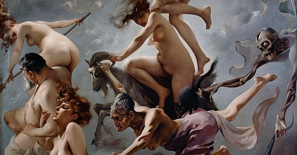
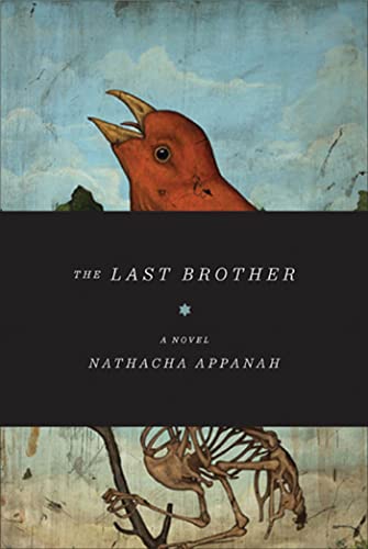
| The American cover is especially striking, with the bird and skeleton looking like something out of an old illustrated encyclopedia. And the wide black band suggests something important is hidden within. The British version feels generic, with the beach-front watercolor looking like a perhaps slightly more menacing version of the art you’d have hanging in your room at a seaside motel. |
| |
| |
 |
 |
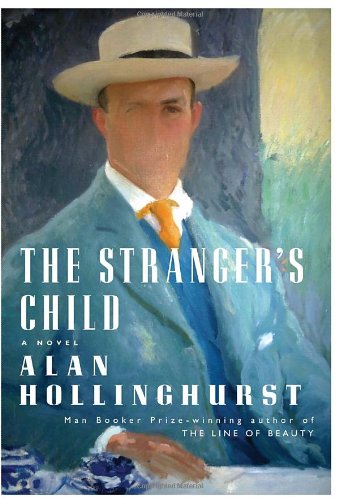
| Maybe these big black bands are a trend in American book cover design, but I think it wins the day here as well, imparting plenty of mystery on the half-hidden, murky photograph that it partially obscures. The British cover is somewhat striking as well, and I do like the watery, bleeding text effect. And whoever thought that floating dandelion seeds could impart foreboding? Maybe this one’s a tie, actually. |
| |
| |
 |
 |
| It’s always interesting when the two covers are riffs on the same motif. I like both, but I think I think the yellow on black of the British version grabs me more. |
| |
| |
 |
 |
| Both are good, but I love the creepy addition of the flies on the British version. |
| |
| |
 |
 |
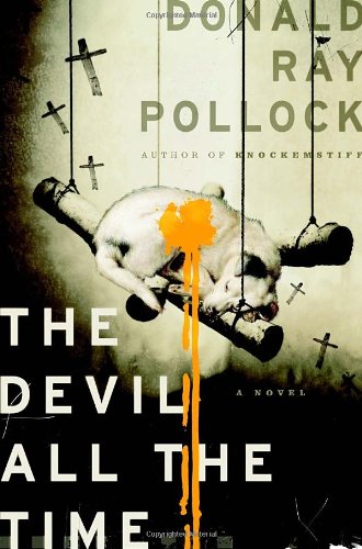
| The U.K. cover tries admirably to evoke the campus setting of the novel, but I love how the U.S. cover offers a stylized suggestion of the lettering used on old baseball uniforms. |
| |
| |
 |
 |
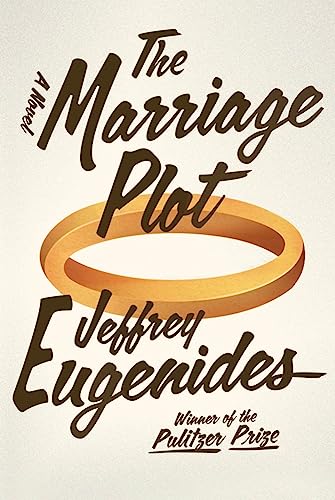
| I don’t love either of these, and the painted out face and the hedge maze both seem a bit heavy-handed in the visual metaphor department. |
| |
 |
 |
| There’s something too advertisement-slick about the U.S. version, while the British version has a dark playfulness that I like. |
| |
 |
 |
| The American version isn’t doing much for me, but I love pretty much everything about the British version, up to and including the way the white splotch behind the title is seeming to reference the sun or moon. |
| |
 |
 |
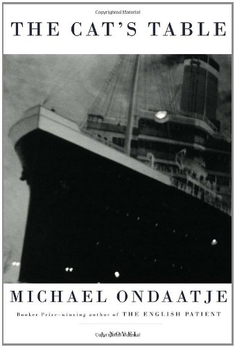
| The American version is surprisingly bland, while the U.K. cover is a great riff on classic ocean liner posters. |
| |
 |
 |
| The British cover goes with another generic, tropical landscape, while the American cover has some great, mysterious detail going on in that border. |
| |
 |
 |
| I don’t love either of these. The American version is visually convoluted, while the British one feels underdone. |
at 7:08 am on February 8, 2012
It would be interesting to know the exact reasons of the publishing companies choices. Why a different cover on the other side of the Atlantic? The cover does make a difference for the reader, for example,I wanted to read ‘The Paris Wife’ by Paula Mc Lain but I waited until I could get the American edition which showed a woman in a blue suit obviously sitting at a Paris Café, it exactly reflected my fantasies before reading the novel whereas the Art Deco cover of the Canadian edition that I was able to get would not inspire me at all. Ironically, we also judge a book by its cover.
at 7:37 am on February 8, 2012
“There’s something too advertisement-slick about the U.S. version, while the British version has a dark playfulness that I like.”
Is that meant to be a joke? The U.S. cover for 1Q84 is one of the best things the novel has going for it. Chip Kidd made a brilliant design.
at 9:02 am on February 8, 2012
The top three American versions seem more sinister than the UK versions. I love the UK version of The Cat’s Table–the American one almost seems like a non-fiction history book or something.
I wouldn’t buy the UK vs. of The Art of Fielding because I have a ridiculous aversion to anything chalkboard. Bad reason not to buy a book? You betcha. Yet, it’s true! And why, why has a dog been shot and is bleeding mustard in the US vs. of The Devil All the Time??
at 9:14 am on February 8, 2012
This is very cool, and it makes me appreciate the trouble my publisher went through to get the cover for my book just right.
at 9:28 am on February 8, 2012
Always enjoy this feature. One of the ToB finalists you didn’t include, The Sisters Brothers, was probably my favorite cover of 2011. No surprise they basically kept it the same for the UK release.
The American Art of Fielding cover was another of my favorites – the throwback baseball font is terrific.
at 10:09 am on February 8, 2012
I disagree with your assessment of “1Q84,” since Chip Kidd’s design was the tipping factor in buying the book in the first place. (So I’m sure Knopf is happy about that one.) Especially considering the layering of the jacket and cover and the images over images. The U.K. one sees more generic to me. And I like the US “Marriage Plot” mostly because I think Rodrigo Corral makes interesting covers.
But what about Swamplandia! ? (Which the U.S. has over the U.K.)
at 10:26 am on February 8, 2012
My favorite ToB title Kate Zambreno’s Green Girl isn’t included! I don’t think the U.K. version is different, but the book takes place in London!
at 10:51 am on February 8, 2012
Arturo Ulises,
Are you saying that the top graphic designer in the business, making a cover for one of the larger books of the year, isn’t advertising slick? I love Kidd in general, but really, his Murakami covers are pretty much his worst work.
at 10:58 am on February 8, 2012
@jecqueline dubois
Most of these books are published by different publishing houses in different countries, so when the house gets the rights for the book, they often look at how it sold and if they feel they can improve upon the cover or make it pop more for the demographic they are trying to reach, not to mention whether they want to pay for the rights to the original artwork.
Many times it’s just cheaper to redesign a cover in-house and the designer will retain elements that they feel worked well on the original cover, as in those for OPEN CITY and THE ART OF FIELDING, which have fairly similar design choices.
at 11:53 am on February 8, 2012
I’m going to agree with Matt and Arturo–I think the American 1Q84 is great. Definitely better than the UK cover, which looks really busy.
Also, I think both State of Wonder covers are terrible, but especially the American one. It looks so bland and generic! I’ve heard good things about the book, but you’d never know it from that cover. I don’t know why, but Ann Patchett seems to get a lot of bad covers.
at 12:17 pm on February 8, 2012
I hate the US cover of “Devil All the Time” — it looks like a giant turkey when I glance at it too quickly.
at 12:25 pm on February 8, 2012
[...] a stroll through the posts here, here, here and here. /* [...]
at 12:30 pm on February 8, 2012
I got to say, I do actually prefer the red and yellow Open City far more. It’s a more intense color combo.
at 12:36 pm on February 8, 2012
While in the UK this summer, I observed this habit first hand. I was instantly attracted to the beautiful covers of Cloud Atlas and The Hare with the Amber Eyes. Upon returning to the US and seeing the American cover to The Hare with the Amber Eyes, I deeply regretted not purchasing it while in the UK. Food doesn’t have to be be attractive to taste great but when it is, it can lead one to salivate.
at 2:05 pm on February 8, 2012
The British version of the Marriage Plot looks like an airport book…….
at 2:11 pm on February 8, 2012
Please tell me that’s not two different people named “David” and that he is having a laugh. The article is about different covers of books between US and UK editions, and David takes issue with the omission of two books which, by his own admission, were published in both countries with the same cover?
Reading is fundamental.
at 2:39 pm on February 8, 2012
I don’t mind the visual design of 1Q84, but as a bookseller, I hate the thin mylar cover. Gets torn and creased all the time, and certainly wasn’t designed for longevity…
at 3:33 pm on February 8, 2012
Either cover, 1Q84 is a terrible novel.
at 3:56 pm on February 8, 2012
[...] at The Millions C. Max Magee has an article comparing US and UK book covers, and I thought I would add to the comparative debate by looking at international covers of a few [...]
at 4:23 pm on February 8, 2012
I love the side-by-side comparisons. I find it so interesting that books have different covers to supposedly appeal to different countries. Do movie posters do the same?
Here, I mostly get the same sense of the book from each cover – perhaps I’d think the story was a shade darker in some cases. Maybe the only exception would be IQ84 as they are so different.
at 6:52 pm on February 8, 2012
First off, I think it’s certainly an interesting topic. As a bookseller, as well as a mildly (ok wildly) addicted reader/buyer of books, I know the importance of great design in encouraging someone to pick something up for a closer look. Personally, I love the 1Q84 cover design, although I empathize with Emily Pullen’s point about the fragile jacket (which I think is vellum, but whatever). Glancing at my shelves I can list several books that I was first prompted to look at a little more closely just because of the covers. Luminarium by Alex Shakar (although I remembered his great piece here as well when I saw the name) and A Visit From the Goon Squad being two examples. What I do find weird is that sometimes in Canada, we get UK editions, or international (read: not American) trade paperback versions, and sometimes we get the US ones. I’ve bought books in other countries just to get different versions, and once had an author send me a UK version (unprompted, but most appreciated) after I wrote him a fan letter. The bottom line is, in my opinion, that attractive book design leads to more physical book sales. Which, as a bookseller and buyer, makes me happy.
at 8:39 pm on February 8, 2012
A thousand agreements to Emily and her discontent over 1Q84′s fragile dust cover. Visually, it’s a great design, pretty much the best part of the horrid book, but it’s not practical: at my bookstore we struggled to keep it pristine, a doomed battle from the start as a healthy portion of them arrived to us already bent or wrinkled from shipping. I personally lost at least one sale to this poor design choice–frustrating.
at 8:53 pm on February 8, 2012
[...] is a cool article discussing the differences between book covers in the UK and book covers for the same books in the [...]
at 9:08 pm on February 8, 2012
Have you seen the Canadian cover for The Cat’s Table? It’s one of the instances where they chose a different route from both the UK and US co-publishers. It’s got a softer, more historical archive quality to it.
Personally, I can’t stand the US design. The UK’s effort was better, but I’m not sure any one company got it right.
I am not a Chip Kidd fan. I agree his design was too advertorial, too slick. And from a production standpoint, it was a pain in the ass to get the registration right on the case wrap and jacket.
at 1:08 am on February 9, 2012
[...] Judging Books by Their Covers: U.S. Vs. U.K.. [...]
at 5:56 am on February 9, 2012
[...] ovvio il design delle copertine cambia nei vari Paesi, come dimostra l’articolo Judging Books by Their Covers: U.S. vs. U.K., che mette a confronto le copertine statunitensi e britanniche di libri famosi. Prendiamo Murakami [...]
at 2:01 pm on February 9, 2012
[...] book I decide to pick up and read. And so that’s why I had to share this fun article from The Millions which compares US and UK book covers [...]
at 11:03 am on February 10, 2012
I sometimes buy the UK version of book over the American because of the cover art. The latest cover that bothers my aesthetic sense if for a non-fiction book, “Quiet,” by Susan Cain. I like the white, understated British edition, featuring a small speech bubble that holds the title. The American edition, however, is a schmeary gray background, with the title in red. Ugly, ugly, ugly.
at 11:46 am on February 10, 2012
[...] at The Millions this week, they compared the U.S. vs U.K. covers of recently published books. I always thought it interesting in principle to design different covers to reflect different [...]
at 9:28 pm on February 10, 2012
I’m actually reading The Devil All the Time right now, and now that I’ve looked at the cover more closely, I think I’ve finally figured it out—it seems like it’s channeling the opening credits of the TV show True Blood.
at 4:56 pm on February 11, 2012
[...] The Million (8 Feb) – Judging Books by Their Covers: US vs UK [...]
at 6:17 am on February 12, 2012
In general, I’m not sure British publishers really want to sell books at all. So many of their covers are numbly blank, if not actively screaming “this book is a load of crap” (apologies to Larkin).
at 4:33 pm on February 12, 2012
Can someone explain why practically all of the American covers have the novel’s title followed by ‘a novel’? Do we really need to be told the novel in front of us is a novel??
at 4:26 am on February 13, 2012
Personally I find those black bands on the US versions infuriating – I want to see what’s behind them! But then I’m a Brit…
at 8:27 am on February 13, 2012
Always enjoy these comparisons. Reminds me of the time I was a UK bookseller transplanted to Michigan for a few months. At the start I was unable to find any of the books that I knew so well in their US camouflage. By the end of course I’d switched back, and couldn’t find half of the stock at a glance when I got home.
For my tuppence… the Eugenides cover is better in US version (the font wins) but I wish it had the flies. The Murakami US cover is horrible, I’m amazed that it’s Chip Kidd. Maybe it’s better in the flesh. The UK version is fine, but the red brush strokes on the actual cover beneath the dustjacket are really quite nice.
I was disappointed with the writing of both novels however!
at 4:07 pm on February 13, 2012
The (US) cover of STATE OF WONDER actually kept me from taking it out on at least three separate visits to the library. I finally gave in when it was named to so many lists, incl. the Rooster. The UK one is about equally terrible, though.
at 10:38 pm on February 13, 2012
I’m not sure anybody mentioned that the wedding band on the American version of The Wedding Plot is a Mobius strip.
Off topic, but are we about done now with the “The So-and-So’s Female Relative” format for novel titles?
at 11:30 pm on February 13, 2012
[...] Read More>> Advertisement GA_googleAddAttr("AdOpt", "1"); GA_googleAddAttr("Origin", "other"); [...]
at 4:36 am on February 14, 2012
This was the first time I have ever read this column and I found it very interesting. As an artist and a reader I have always attached a great deal of importance to the covers of books, and everything else for sale. I tend to be more attracted to book covers that are illustrated by hand. This does not preclude intriguing photographs done with an artist’s eye. I also have come to appreciate fonts as an important design element. It is hard to judge the covers without knowing the contents, as the main purpose of the cover is to convey and enhance the author’s intention (ideally) and to get the book into the hands of the public. I did not agree with all the assessments, but for the most part, and from the perspective of one ignorant of the contents, I did agree with your judgments.
at 7:13 am on February 14, 2012
[...] Here’s a great post on book covers in the US vs. in the UK. [...]
at 8:43 am on February 14, 2012
I think in the case of Julian Barnes he is more well known in the UK and most of his book covers here seem to use a similar font. I think this explains the text-based cover on The Sense of an Ending; it’s a branding exercise that works on UK book buyers in a way that it wouldn’t in the US.
at 2:51 pm on February 14, 2012
I do this meme on my blog. I agree with most of your picks. It amazes me how the US and UK covers always differ. It seems covers appeal differently to readers depending on their residence.
at 5:41 am on February 15, 2012
I iive in Tokyo, so in bookstores I often can choose between US, UK, and International version covers! If I do not know anything about the book or author, sometimes I buy purely on jacket design (the Japanese word for this is “jyake-gai” literally “jacket buy” though more used for buying music). For IQ84, I picked Chip Kidd: yes very slick but the layers were great. The Japanese version was very bland, the UK a bit too dark. I did not know the vellum cover would be so troublesome to the bookstores, but I liked how the book theme was continued in the page number placement. Loved the UK covers of The Tiger’s Wife and The Cat’s Table. More next year, please!
at 10:56 am on February 15, 2012
[...] Judging Books by Their Covers: U.S. Vs. U.K., by C. Max Magee – “We thought it might be fun to compare the U.S. and U.K. book cover [...]
at 2:24 pm on February 15, 2012
[...] a novel in the US and its international counterparts. A recent post at the Millions looked at a few different US/UK novels, and I thought it would be cool to look at some popular YA or children’s titles as well. I [...]
at 8:56 am on February 17, 2012
Personally, I don’t think the “average” reader gives a fig about the cover being accurate to the book. As long as it’s eye catching and sells sex or violence it’ll sell. I also think that some, if not most, of the covers on all the books compared are bland. I feel you are reading too much into things like a black band suggesting something important being hidden. Then, again, I’m just an “average” reader.
at 8:01 pm on February 17, 2012
The British version of Julian Barnes’ novel reminds me of Nicole Krauss’ The History of Love cover. Her was blue, but the type is the same and is the right formatting. I like how the British version seems to fade and play tricks with your eyes, however.
at 12:53 am on February 22, 2012
[...] of the book, doesn’t match what you see on Amazon and in American bookstores, it’s because, once again, the American cover has been dumbed down, diluted, and graced with the mandatory cat. Yes, American [...]
at 1:15 am on February 25, 2012
[...] 6. Judging Books by Their Covers: U.S. Vs. U.K., from The Millions [...]
at 9:35 am on February 25, 2012
Are most of you guys American? I’m English and find the ‘bland’ covers (that so many of you dislike) often more appealing than the American alternatives, which tend to look a bit strange to me. Clearly the people in charge of choosing the covers understand their market well!
The Art of Fielding is an interesting one. Having read the comment re baseball, I understand why you guys like it better, but before reading that, I thought it just looked colourful and oddly loopy, whereas the British cover instantly put me in mind of old-fashioned summers playing cricket. So clearly the cover conveyed the correct feeling adjusted for the relevant market.
at 7:30 pm on March 3, 2012
Great post. We didn’t agree on most of the covers, but I did enjoy your perspective. Made me take a second…and sometimes a third look in determining what motivates me to pick a particluar book up for a closer look.
at 10:40 pm on March 17, 2012
[...] of the book, doesn’t match what you see on Amazon and in American bookstores, it’s because, once again, the American cover has been dumbed down, diluted, and graced with the mandatory cat. Yes, American [...]
at 4:28 pm on March 31, 2012
I’m from the US and prefer the covers marketed towards us! Except for The Tiger’s Wife and The Cat’s Table…
at 7:47 am on April 23, 2012
i recently purchased The Marriage Plot here in Amsterdam, and I love this cover. I was pleasantly surprised that it was different than the covers I had seen previously. I didn’t even realize it was different for a reason, as in, there are different covers for US books & European/UK versions.
I just moved to AMS 6 months ago, so needless to say I am still learning & adjusting to all the differences.
interesting post, good read.
at 10:08 am on April 29, 2012
[...] Some very interesting comparisons of the last year’s novels on The Millions. [...]
at 8:50 pm on June 15, 2012
[...] of Book Cover Designs and Designers The Book Desing Review The 20 Most Iconic Book Covers Ever Judging Books by Their Covers: US vs UK Sviđa ti se?Sviđa mi seBe the first to like [...]
at 4:40 pm on October 5, 2012
Interesting analysis. Authors, in general, do not have much say about their covers. I was shown covers to all of my novels and nonfiction books, but did not really have veto power. The ultimate call was my publisher’s. In contrast, Kindle can give authors that power. I decided to keep the cover for my “author’s cut” of The Silk Code exactly the same for the US and the UK – because I like the cover so much, and think it has universal appeal. See this discussion about judging books by their covers for more http://karensdifferentcorners.wordpress.com/2012/10/04/judging-a-book-by-its-cover-part-3-cont-and-5-more-covers/#comment-1040
at 4:25 pm on November 27, 2012
[...] Interestingly, it doesn’t work the other way around. It is very rare for adult American fiction to be translated into British English by major publishers, but they are nearly always given a different cover. Here are some examples. [...]
at 2:13 pm on December 6, 2012
[...] such as The Millions who have been compiling an annual comparison (usually of titles of American Origin) for the last [...]
at 4:29 am on March 10, 2013
[...] Cover Design: US vs. UK [...]
at 1:38 pm on April 24, 2013
I will design my own covers, the covers will help me with my fictional novel i am working on. thanks for this post.
2011, 2010, 2009, 2008, 2007, 2006, 2005
Best of the Millennium; Readers' List
A new way to browse The Millions! Books and Reviews
Bookmark these links to stay on top of the hottest books:
Hot 100 | Awards | Movers & Shakers | Bargain Books | Kindle Bestsellers
Subscribe to RSS feeds for new releases: Literary fiction (for Kindle) | Biography | Graphic Novels | Food | History | Nonfiction | Science | Travel | New Release RSS Feeds for Movies, Music and More
More From Books as Objects
More From Notable Articles
Other Recent Articles
Recent Comments
2012, 2011, 2010, 2009,
2008, 2007, 2006, 2005
Readers' List
© Mmix The Millions. Some rights reserved. This work is licensed under a cc attribution-noncommercial-Sharealike 2.5 License.