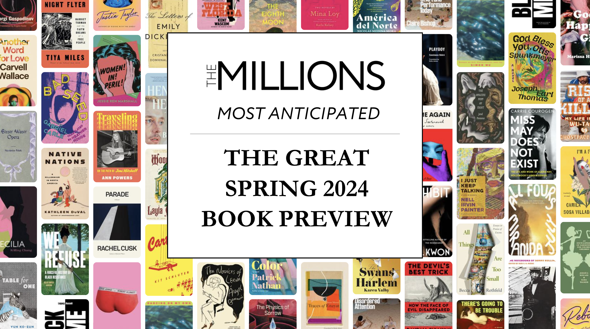
Like we did last year, we’re going to have a little fun comparing the U.S. and U.K. book cover designs of this year’s Rooster contenders. Book cover design is a strange exercise in which one attempts to distill iconic imagery from hundreds of pages of text. Engaging the audience is the name of the game here. and it’s interesting to see how the different audiences and sensibilities on either side of the Atlantic can result in very different looks. The American covers are on the left, and clicking through takes you to a larger image. Your equally inexpert analysis is encouraged in the comments.
 |
 |
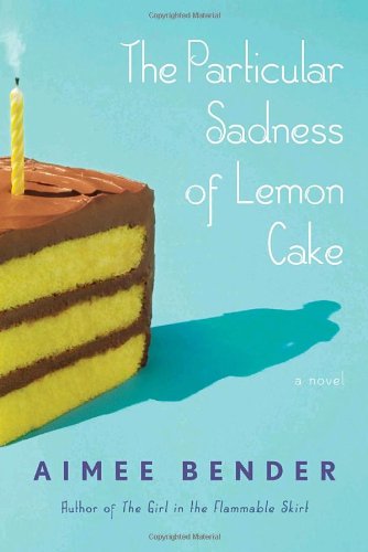
| At first glance, these are both a little cheesy, but closer inspection of the American cover reveals a clever trick: the shadow of the cake is the silhouette of our despondent protagonist. The U.K. cover, meanwhile, is a bit too on the nose. Lemons, check. Cake, check. Particular Sadness, check. | |
 |
 |
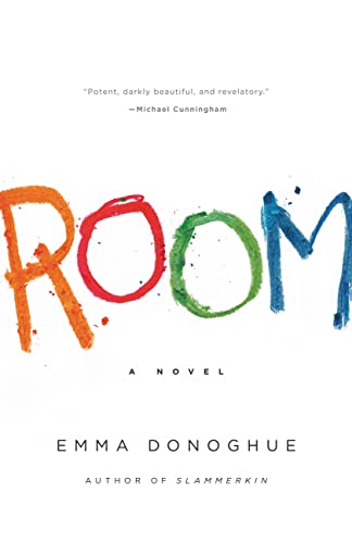
| These are both appropriate creepy, and while the U.K. cover gets points for the claustrophobic smallness of the toy house, I think the U.S. cover is better here. there’s something harrowing about that crayon scrawl on the stark white background. | |
 |
 |
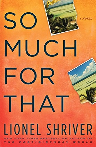
| These are both pretty great. The U.S. cover is simple and memorable with those curly guitar strings hinting at the drama within. The U.K. version is more playful, and I love the slightly sunbleached and tattered effect. | |
 |
 |
| Franzen’s Cerulean Warbler on the U.S. cover has become somewhat iconic stateside. In the U.K., they give us a feather and a big “F” instead. | |
 |
 |
| The U.S. cover is awfully bland here, while the U.K. cover is pretty stunning, with a clever visual pun. | |
 |
 |
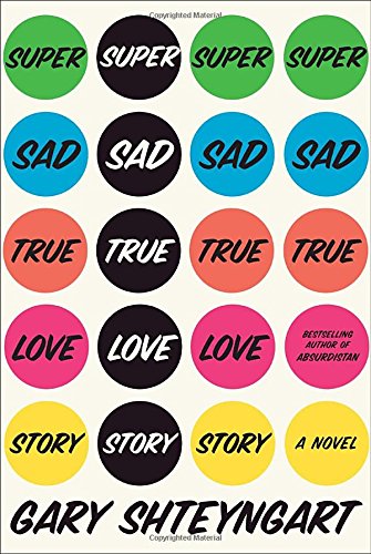
| The U.K. cover has a cool throwback sci-fi vibe going on, but the U.S. cover is one of the more visually arresting efforts in recent years. | |